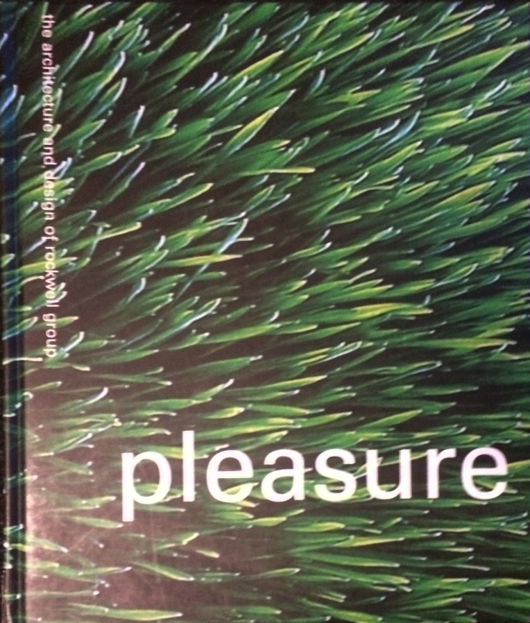
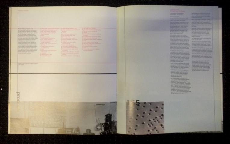
For a firm that makes such concrete work, the set up of this book is pretty abstract. I like that they seem to value the influence of text over images, but with that, they can be even more misleading (as it’s often simpler to mislead with a word than it is with an image). Abstracting descriptions from images to text makes it all even more abstract. While the titles and imaging is interesting and conceptual, the layout is pretty predictable, which is frustrating when the words and images are uncomfortably small on such a large page. Though I think white space can do a lot for layout, here it feels forced, again like they’re trying to be something they’re not.


